Hang Here - Native Reading App
A book reader that turns pages like a feed, and never loses your line
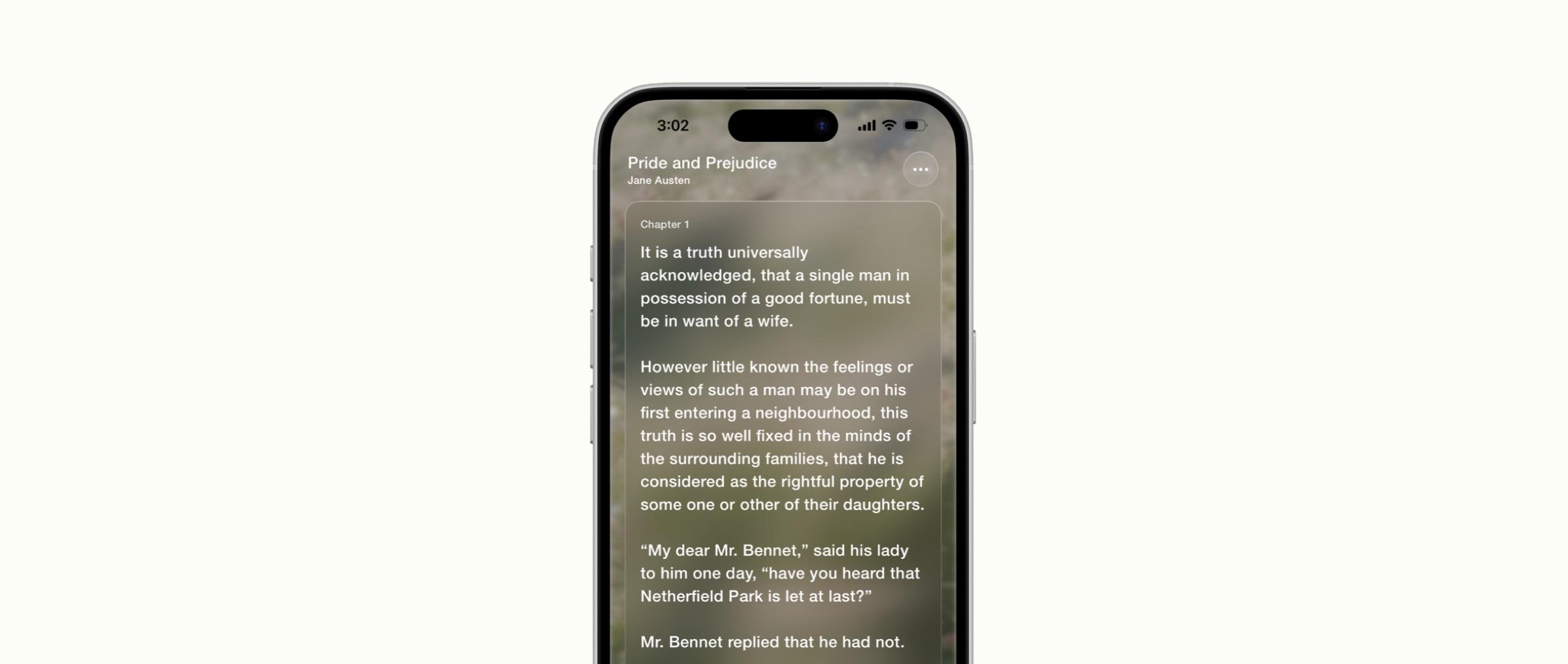
Hang Here is a native iOS reader for people who read on their phone. You open it and you are reading: one full page per swipe, the same effortless vertical flow as a short-video feed, but for books. It is on the App Store.
- Year
- 2026
- Role
- Designer and builder
- Team
- Personal project, built with Claude Code
Overview
Most of my reading happens on my phone, in the gaps of a day, and phone readers are built like small e-readers: a library first, the book second, pages that turn sideways. Hang Here starts from the other end. The app lands on the book you are reading, and swiping up turns the page.
It is a passion project, and the reading experience is the product: it should feel better than existing readers, not different for its own sake. I designed every screen in Figma, wrote the specs and the decision log, and directed the build in Swift and SwiftUI with Claude Code, with my phone as the test bench. It launched on the App Store on November 4, 2026, and you can download Hang Here for iPhone.
Version 1
- Public-domain books bundled whole, from Standard Ebooks
- 5
- Specs, one per part of the app, deciding numbers and behaviour
- 10
- Unit tests, with zero compiler warnings at handoff
- 239
Pages, not a scroll
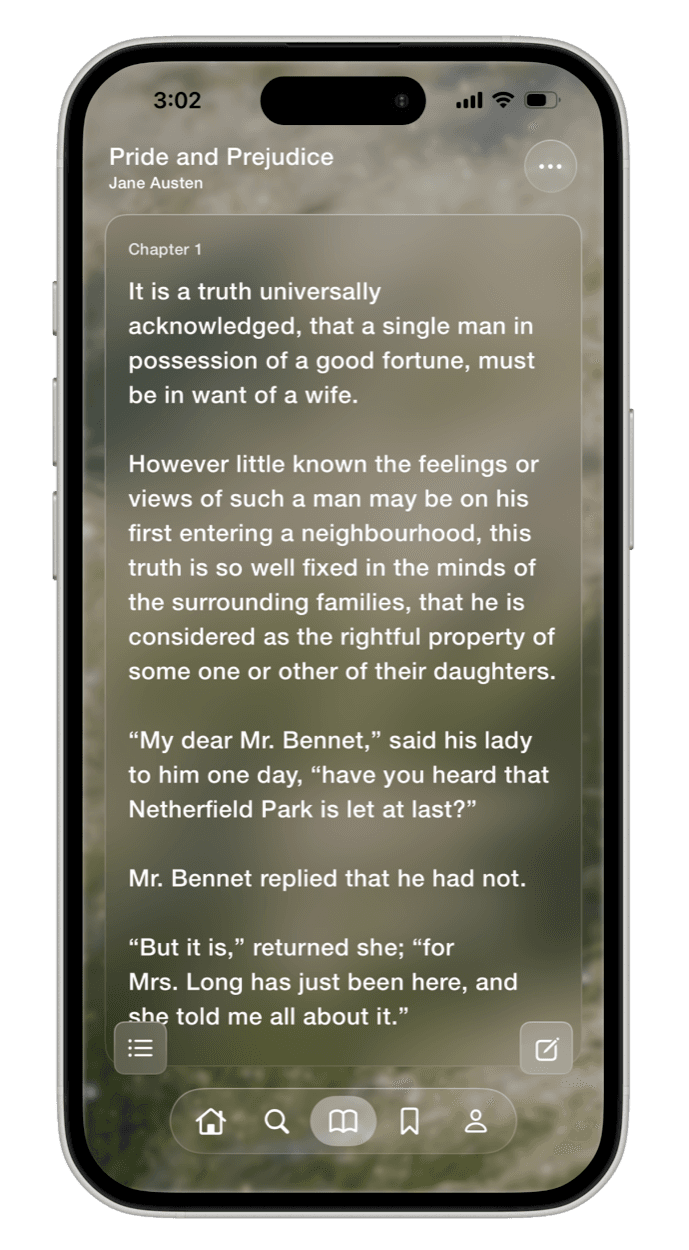
A continuous scroll loses your place: there is no edge to stop at, and nothing to tell you where you were. So each page is one full screen. Swipe up for the next, down for the last, with a plain snap and a light haptic. No page-curl animation.
The detail I cared about most is the repeated line. Every page begins with the last line of the page before it, and on that earlier page the line sits deliberately half-covered by the corner buttons. When you swipe, the line you were half-reading is the first thing you see. It is a rule in the pagination engine, not an accident of layout, and the engine's tests check that no text is ever skipped or doubled apart from that one line.
Rules that shaped the reader
- Your place is a character in the text, never a page number. Pages change with font, size, spacing and mode, so the reader saves where in the book you are and re-cuts the pages around it.
- The top line stays the top line. Change the text size mid-chapter and the line at the top of the screen is still at the top.
- Edit mode locks the page. Selecting text and turning pages never compete for the same swipe, and the panel gets a bright border so you know which mode you are in.
- Focus mode hides the buttons but keeps the panel's height, so a double tap never moves a page break.
When the system's glass wasn't the frame
The visual direction is iOS 26's Liquid Glass: a blurred photo, a frosted panel, white text. The first build used the system's glass for the text panel, and on my phone it was wrong. The panel had a hard white rim, almost no frost, and none of the darkening the frame called for.
Each of those came from the system effect, and none of them had a setting. So the panel became three tokens of its own: a fill, a frost and a hairline. The frost is a second, more blurred copy of the background cut to the panel's shape, drawn once so a page flip never re-runs the blur. The buttons and the tab bar kept the system's glass, where it matched. A side effect I hadn't planned for: the simulator now shows the panel exactly as the phone does.
Marking up a page
Tap a word, drag to take more, and a Markup panel opens beside the selection: six highlight colours, a note, and one photo taken with the app's own camera and cropped to any shape. Highlights are stored as a range in the text plus the quoted words and a little of their context, so they can find their place again if an edition is corrected.
Highlights also feed the Feed. In v1 it is a personal one: the Book of the Month, then your own highlights and notes with their photos, then one post per book. Tapping a post opens the book at that passage. Nothing leaves the phone.
Reading before onboarding
The first launch shows a wordmark and a Start Reading button, then page one of Pride and Prejudice. The onboarding waits until you have read five pages: a display name, a favourite book, then a walkthrough. The walkthrough runs over the live app, lighting up the real buttons and opening the real sheets, so it can never show a screen that has since changed, and it fits any iPhone.
Five books, built for thousands
Version 1 ships five books, but the library is meant to grow constantly, so nothing assumes a small one. A book's details live apart from its text, so browsing and search never load a chapter. The reader paginates the current chapter and its neighbours only, with layouts cached by book, chapter, font, size, spacing and mode, so memory stays bounded however long the book is. Tests run against a very long book and a synthetic catalogue of thousands.
One part of the future catalogue arrived early. East of Eden is public domain in Canada and not elsewhere, so it is never bundled. A small content host serves it only to connections from Canada, and the app shows whatever the host offers. The same host schedules the Book of the Month, so it changes each month without a release.
Shipping it
Around the app sit the things a real release needs: hanghere.app, with a waitlist and a monthly bookclub page; privacy and terms pages generated from the same text the app shows, so the two cannot drift; credits for every book, font and photo. The first App Review came back with questions about fonts and user content. The page now defaults to SF Pro, with Source Serif 4 bundled under its open licence as the serif option. Hang Here went live on the App Store on November 4, 2026.
What comes next
Version 2 adds a free account for markup and saved progress, while the free book stays readable without one. Every save in v1 already goes through a small protocol and one entitlement check, so accounts and sync replace what sits behind them without touching a screen, and the markups people make now move into their account.